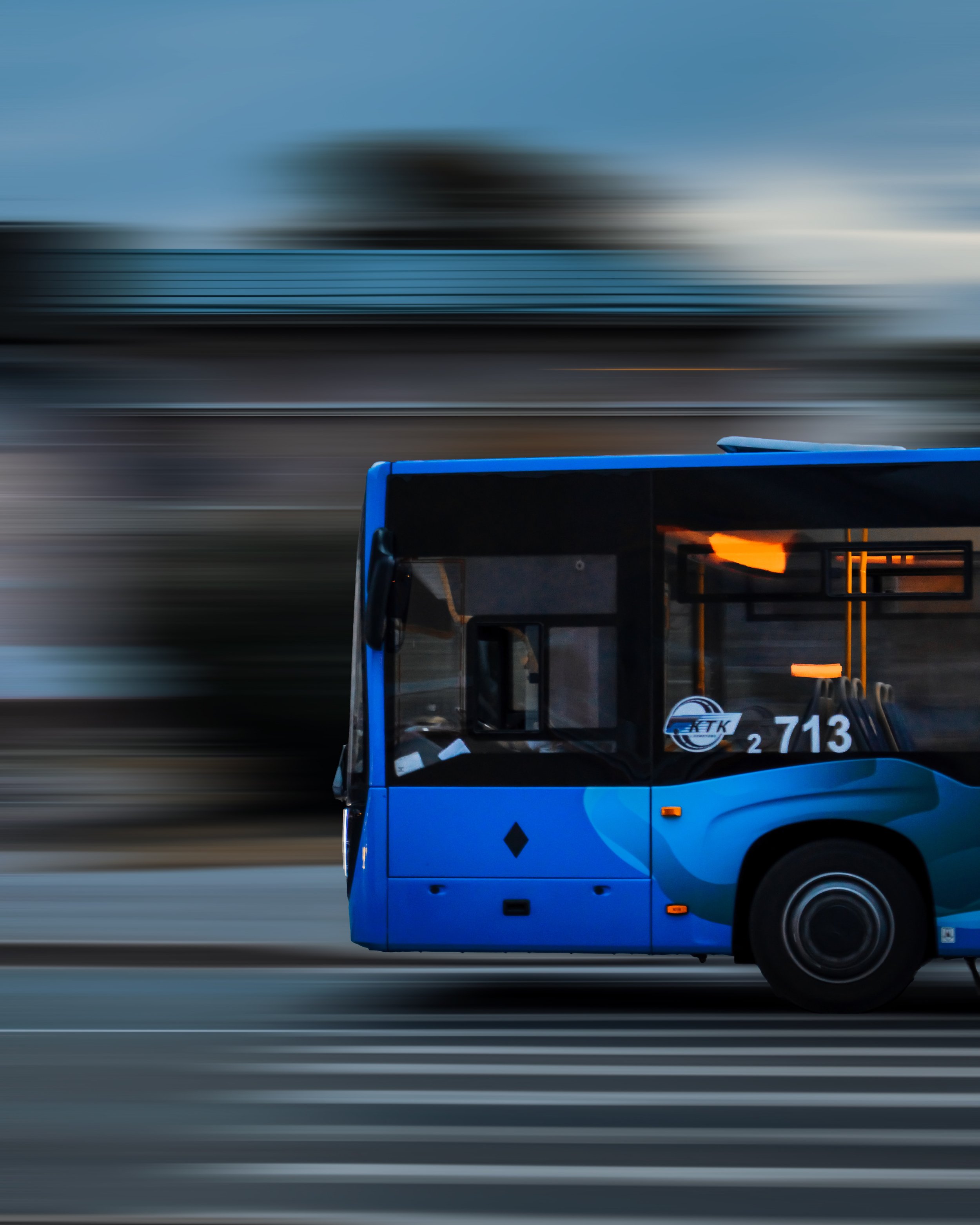
A clear solution to a complex transit system
Project Overview
-
Summary
Our client, a midsize transit company in the midwest, tasked us with designing a mobile application that would help clarify their bus schedules & aid reiders in navigating its busiest station. We used a variety of tools and research methods to present our client with a thoughtful prototype designed for accessibility.
-
Roles & Responsibilities
I was responsible for the end-to-end design process of our product, including:
Product strategy
User research & analysis
MVP definition
Wireframes
UI design & prototyping
Usability testing

The Problem
After expanding and adding numerous bus routes, a local bus stop became crowded and difficult to navigate.
Riders wanted to know when the next bus would arrive, and how much time they had to get to the stop. The city developed a way to tell how far each bus is from the stop but wasn’t sure how to share that information with riders. We developed a mobile app for this purpose.
Audience
We primarily targeted bus riders aged 20-60 who used smartphones for this design.
The Solution
We designed a simple and effective local transportation app, which met our client’s business requirements and provided a solution to our bus rider’s pain points. Mibus is a clean and accessible solution to the confusion at Washington & State, including real-time ETAs and schedule updates for our users.
Design Process
We worked within the scope of the client’s business requirements and followed a five-step design process: Empathize, Define, Ideate, Prototype, Test.
Research & Discovery

Summary
We used various research methods to provide an essential foundation for our design strategy. We performed a competitive analysis, user surveys, user interviews and created a user persona.
Staying within scope, we established that our product should provide users with the most valued features of a transportation app, centering on accurate local schedule information.

Competitive Analysis
We performed a SWOT analysis to evaluate the strengths, weaknesses, opportunities & threats of two popular transit apps: Google maps & Citymapper. Both are robust transportation apps with complex integration, exhibiting many strengths including comprehensive route options and multiple modes of transportation. However, Citymapper’s UI felt cluttered with a high cognitive load; Google maps displayed small bus stop icons that could be difficult to tap by some.
We found an opportunity to differentiate ourselves (and limit the threat of comparison) by designing for our local users and prioritizing accessibility. We focused on keeping the cognitive load low with clear UI, large buttons & text. We chose the route of a simpler, effective alternative.

User Persona
We created a user persona based on our research to establish reliable and realistic representations of our key audience for reference.

User Surveys
The results from 37 survey participants showed us three key factors to consider in our design:
Over 80% of bus riders are commuters
Most people believe real-time ETAs are the most important function of a transportation app
Most users are already satisfied (or very satisfied) with their current transportation app

User interviews
We dove deeper into bus riders’ goals and pain points with one-on-one interviews. We found that potential users are likely to value schedule accuracy, clarity of information, and simplicity of design the most.
Information Architecture

User Stories & User Flows
We used our business requirements to create high-priority user stories that served as the basis for the user flows. We sketched out the flows and then created digital versions in Figma, (viewable below).


Sitemap
We designed a lean structure for the app, maintaining a maximum of 3 click-only interactions to view all information.
Wireframes

Sketches
We hand-sketched our initial wireframes, refining them later in Figma to serve as the basis for our prototype. (See digital wireframes below)

Homescreen

Bus line selection screen

Individual bus line screen
Prototype

Splash screen

All bus lines screen

Individual bus line screen

Homescreen

Iterations
Before our usability test, we made some key iterations.
We adjusted some of the colors after an A11y color check and created more space within schedule lists for better readability. We maintained the click-only navigation and moved the controls to the bottom of the screen for one-handed use. We also added a splash screen.
Usability testing

What we did
We recruited 3 users for prototype testing with Maze user testing software. We designed 3 tasks for the users to complete, based on our high-priority user stories. We invited users to complete the remote testing, and the results were telling

What we found
The app proved to be easy to navigate, but users clicked beyond the clickable areas. We enlarged the icons and included clear affordances on all clickable items.
Final Thoughts

Key takeaways
We learned a great deal through this design process. We learned through testing that users can surprise you, and affordances should be made for all possibilities. We learned that simple does not necessarily mean less and that universal usability is a great goal. Finally, we found that continuous iteration, and collaboration, is the key to great design.

Next Steps
Add location service functionality
Build out the map and routing services
Travel-time estimates
Account creation & login
Ability to set your regular bus line