Delivering your news, mindfully
Project Overview
Summary
MindFull addresses news anxiety and information overwhelm by helping users stay informed without spiraling into doom-scrolling. I shaped the product's tone and interface to create a calming, controlled news consumption experience through intentional content strategy and empathetic design.
My role
I led the end-to-end design of MindFull, focusing on creating a calming news experience that wouldn't trigger anxiety or overwhelm. My approach centered on content strategy, emotional tone, and interface clarity to help users stay informed while maintaining mental well-being.
Developed content strategy and voice guidelines
Designed user flows that prioritized emotional safety and control
Created wireframes and prototypes with calm, digestible IA
Conducted user research to identify news anxiety triggers
Wrote UX copy that reinforced control rather than helplessness
Established visual design principles supporting mental clarity
Conducted user testing and iterated based on feedback about emotional response to the interface
The problem
Rapid global change creates pressure to stay informed, but at a significant emotional cost. "I used to read before bed. Now I scroll through news until 2 am and wonder why I can't sleep," one user told me.
Most platforms felt overwhelming, negative, and emotionally indifferent. MindFull set out to solve this tonal problem—what users needed wasn't more content, but a more conscious, emotionally attuned experience.
The solution
Our goal with MindFull was to reimagine how users engage with news by giving them not just filtering tools, but thoughtful language that fosters calm, trust, and autonomy.
My work focused on shaping content that reinforced user agency at every touchpoint: opt-in notifications, softened error messages, empathetic onboarding prompts, and intentional microcopy that offered clarity without pressure.
Process
User Research & Tone Strategy
Survey Insights
Initial user research revealed key insights about how people engage with news apps emotionally and behaviorally:
67% of users felt depressed or overwhelmed by the news
89% of users read news on mobile daily
56% of users wanted to stay informed, but on their terms
These insights suggested product language needed to decrease urgency, offer emotional space & reinforce user control.

Interview highlights
These quotes directly informed softer empty states, opt-in notifications, and more mindful button labels. I avoided language that reinforced guilt, urgency, or shame.
“I want to read about something that seems constructive… not just another terrible thing that happened.”
“The news is SO overwhelming.”
“I used to read more creative fiction, but now that feels irresponsible – like I need to know everything that’s going on in the world.”
“I do feel somewhat guilty for not knowing more about what’s happening.”
Competitive analysis and content opportunity
I analyzed several leading news apps—Apple News, Flipboard, and Feedly—to understand how they present information and communicate with users. While each offers strong technical features or customization, none directly addressed the emotional fatigue users described in our research.
These tone gaps helped define MindFull’s voice—clear, calm, and emotionally attuned. I brought that strategy to life through language across the product.

From Research to Design Strategy
Research insights
My research revealed something interesting: people desperately want to stay informed, but the current news experience isn’t serving them. 56% of survey respondents felt "grateful to be informed," while 67% simultaneously felt overwhelmed, angry, or depressed by news consumption.
This tension became my north star for content decisions.
The solution: Give people agency
These insights shaped my core content principle: help users feel in control of their media experience rather than victims of it.
What I learned
People don't trust their news feeds "I don't trust the news, but I still want to know what's going on." - Andi
Every interview revealed the same frustration: users felt like news was happening to them, not for them. They wanted control over their information, not another algorithm making choices for them.
Overwhelm beats out curiosity "I want to read about things that seem constructive, not just another terrible thing that happened." - Amanda
When 67% of users feel overwhelmed by news, the problem isn't just content—it's how we present that content. This insight led me to prioritize calm, inviting language throughout the app.
Personas
My research revealed three distinct user patterns, each representing a different relationship with news consumption and emotional well-being. Rather than designing for a generic news reader, I focused on these specific users whose needs often conflicted with each other.
These personas guided every content decision, helping me balance Drew's hunger for information, Sarah's need for emotional safety, and Andi's deep skepticism about media sources. Each design choice had to work for all three, which meant finding solutions that felt supportive rather than demanding.


User Stories
Defining user needs
These user stories emerged directly from my research insights, ensuring each feature addressed specific emotional and functional need. Instead of designing for a broad "news consumer," I focused on the distinct challenges Drew, Sarah, and Andi faced in their relationship with news consumption. (Click table to view)
Content Strategy & Voice Design
The research painted a clear picture: people want to stay informed, but their news sources leave them feeling saturated and out of control. My challenge was creating content that honored both their need for information and their emotional well-being.
I focused on one guiding principle: help users feel in control of their media experience. This meant every word choice—from onboarding to error messages—needed to feel supportive rather than demanding.
The examples below show how I applied this principle across different parts of the app, always keeping Drew's information needs, Sarah's emotional sensitivity, and Andi's skepticism in mind.

Research-Driven Content Decisions
My research revealed specific pain points that required targeted content solutions. Here's how key findings directly shaped my language choices:

Building trust through inviting language

Transparency that acknowledges user skepticism

Collaborative vs. transactional interactions
Early Microcopy Decisions
Early on, I revised interface language to reduce emotional bias, clarify user intent, and align the tone with MindFull’s core values: calm, control, and clarity.
These changes were guided by three principles I applied across the product: reduce emotional friction, reinforce user agency, and create clarity without pressure, shaping every message to feel not just useful, but supportive.

Voice & Tone Guidelines
While the initial prototype focused on layout and feature functionality, I refined MindFull's language strategy after user research revealed specific emotional needs. The framework focuses on three guiding principles:
Clarity, Care, and Agency

Voice & Tone Evolution
The following content decisions evolved from my research insights to better align with user needs for agency, clarity, and emotional safety. These examples show how I applied my core principle—helping users feel in control of their media experience—across different interface elements. (Click table to view)
Visual System Strategy
While my focus was on language and content, I also designed the visual system to support tone and clarity. The layout emphasized calm, space, and hierarchy—reinforcing the product’s emotional goals through simple, accessible design.
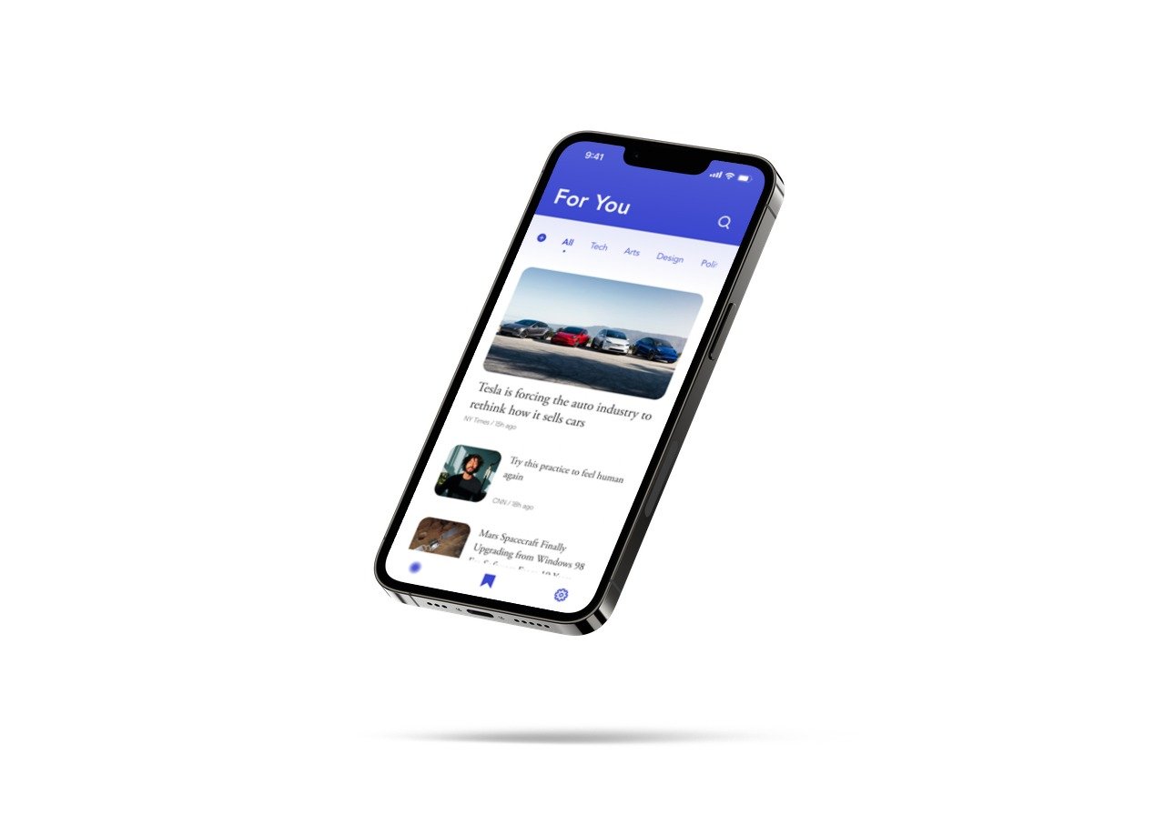
Mockups

Warm, conversational onboarding addresses users' desire for collaborative rather than transactional interactions.

'Cultivate your best media experience' reinforces user control and intentionality over passive consumption.

'Alert' terminology based on user testing feedback that 'flag' commonly means inappropriate content.

Clear feature explanation reduces uncertainty and builds trust through transparency about how the app works.

'Let's get started' and preference language emphasize user agency and choice over algorithmic control.

Curious, inviting language ('would you like') replaces directive commands, reducing cognitive load for overwhelmed users.

Directly addresses user skepticism by acknowledging trust concerns upfront rather than assuming engagement.

Content presentation maintains a calm, organized layout that counters the 'sensationalist' news experience users described.
User Testing

User testing focused primarily on navigation patterns, which led to some layout changes. While copy was not a pain point during testing, I continued iterating post-feedback to better support usability and tone.
Results
Outcomes & impact
✅ MVP Goals Achieved
MindFull delivered on all five core user needs: content control, topic selection, organization, source trustworthiness, and save-for-later functionality.
Key Win: Users reported feeling significantly more in control of their news experience compared to traditional apps.
💬 Content Strategy Success
Shifting from directive to curiosity-based language proved effective: Pick your interests" → "I'm curious about..."
This simple change supported emotional safety and reduced anxiety around news consumption—exactly what our users needed.
🎯 User Testing Validation
Most users completed core tasks with ease, especially slide reactions for content control
Some difficulty with navigation, but I iterated upon the pathways to achieve more intuitive journeys
Testing confirmed our primary goal: giving users agency without overwhelm
📈 Areas for Future Improvement
User testing revealed two navigation opportunities:
Source editing: Users expected this functionality on main pages, not buried in account settings
"Alerted" articles: Placement wasn't immediately intuitive, requiring design iteration
Next steps
🌱 Enhanced Mindfulness Features
Daily check-in to tailor content based on the user's current emotional state
Goal setting for intentional news consumption habits
Time tracker to help users monitor and manage their news intake
Reading time estimates on article pages to support conscious consumption
🔧 Improved User Experience
Integrate source preference controls directly into article feeds
Create a dedicated page for "Alerted" articles for easier access
Add folder organization to the Library page instead of the scroll feed
Refine the layout based on user feedback for more intuitive navigation